6. The tidyverse I - the ggplot2 package
The focus of this series so far has been to cover the basics of programming in R as well how to conduct a range of common analyses. Every function and technique I have covered in the preceding articles can be run in base R; that is, you don’t require additional packages or the most up-to-date version of R in order to be able to run these examples. However, all that is about to change as we delve into one of the R language’s core strengths, the vast array of packages available to users. At the time of writing there are over 10,000 packages available on the CRAN server (a number that will almost certainly be out of date by the time you read this) that make a wide range of data processing, analytical and plotting techniques available to all users. In the next part of this series I will focus on the packages that have become an important part of the palaeontological toolkit such as conducting phylogenetic analyses.
Introducing the tidyverse
For this and the following article I will focus on a series of packages that are changing the R landscape. The tidyverse is a compilation of packages, developed by Hadley Wickham and colleagues, that was designed to make the R environment more intuitive to use, specifically with regards to the manipulation and processing of datasets which can be one of the trickiest aspects of using R, especially for those new to the language or to programming as a whole. I am going to cover some of the functionality within the tidyverse, which has become such an important part of the R world. The tidyverse comprises a number of packages, each of which has its own specific use, such as the stringr and lubridate packages which are used in the manipulation of strings and dates respectively, and the dplyr package which is used in the creation and modification of tidy data (more about tidy data in the next article). The package we will cover here is ggplot2, which makes the production of high quality figures much easier.
Installing new libraries
Before we can use any packages we first need to install them into R. To install any new packages to the R environment we use the install.packages function, using the first argument to specify the package to be installed:
install.packages("ggplot2", dependencies=TRUE)It is very common in R packages that one package (A) will use the functions built into one or more packages (B) so we say that package A is dependent on package B. By including the dependencies argument as above, R will automatically download and install any additional packages that are required for package A to be run, so it is worth using this when installing new packages. As I mentioned the tidyverse is comprised of several packages, and helpfully rather than installing them all separately Hadley Wickam has recently created the tidyverse package which installs the entire catalogue of packages in one step.
install.packages("tidyverse", dependencies=TRUE)A quick note just to say that if it doesn’t work then you may not have the most recent version of R installed; you need at least version 3.0.0 (current version 3.3.2) in order to install the tidyverse.
So, now we’ve installed the tidyverse package, in order to use it we need to load it into the R environment using the library function:
library(tidyverse)This makes the functions and datasets contained in this package, along with any packages that it depends on, available to use in the current R session. It is important to note that you only need to run the install.packages function once but you have to run library in each new session. Also if you are loading in multiple packages at the same time you need to run the library function for each one; you can’t include multiple packages as an array, like this:
library(c(ggplot2, dplyr))This would give you an error because it expects the package name to be a length of one, so use a new line for each package:
library(ggplot2)
library(dplyr)
The grammar of graphics and the ggplot2 package
The ggplot2 package works on the principles of the ‘Grammar of graphics’; in the words of Hadley Wickham ‘It takes care of many of the fiddly details that make plotting a hassle (like drawing legends) as well as providing a powerful model of graphics that makes it easy to produce complex multi-layered graphics’. In simple terms it works by building up plots layer by layer, starting with a coordinate system. As such there are several things every ggplot requires:
- A dataset.
- A set of aesthetic properties that govern how the data points will look.
- The type of plot to be used (geom).
A basic graph
In order to demonstrate the range of options available in ggplot2 I have created a simple dataset that we will use throughout the examples below. The ‘species.csv’ file is available on the PalAss website (see note at the end of this article) and contains information on 52 species including the species, genus and family names as well as the body size, geographic location and geological age.
As always the first step is to load the dataset into the R environment; here I’ve assigned the data to the new variable species. If you are uncertain how to load datasets into the R environment, see the first article in this series. The second line below uses the tbl_df function to convert our standard data frame into a tidy dataset (or a ‘tibble’ which is the essence of the tidyverse; I’ll cover this in more detail next time).
species <- read.csv("species.csv", header=TRUE)
species <- tbl_df(species)
If you take a quick look at the species dataset after you’ve converted it into a tidy dataset you will see that it looks slightly different to a typical data frame. Only the first ten rows of the data are printed to the console along with a short description of the type of data in each variable, such as fctr for factor or int for integer. These tidy datasets are designed to give you a reasonable amount of information about your dataset without flooding the console with all of it.
Now we have our data in the correct format let’s begin by creating a simple plot as a reminder of the default output of the classic plot function, by plotting the age of the species (age variable) against the size of each species (size variable). This will provide a useful comparison against what can be generated using only a few lines of code in ggplot2:
plot(species$age, species$size)There is a lot we could do to change the look of the standard R plot, such as changing the size, colour and shape of points, and giving the axes more appropriate names. While these are simple enough to do and will greatly, and quickly, improve the look of this graph, there are other additions we may want to make such as colouring the points according to a specific variable such as family name, or adding a legend. In base R this generally involves a lot of experimentation and can be frustrating at times, especially if you have multiple plots or want to include several plots in the one graphic. However, as I will demonstrate here, ggplot2 deals with much of the logistics of this and with a couple of lines of code can produce high-quality plots with ease. So to begin, let’s look at the default plot generated by ggplot2 using the qplot function (Figure 6.1):
qplot(x=age, y=size, data=species)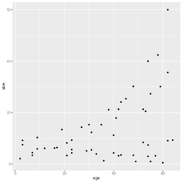
This is useful for creating a scatterplot that is an improvement over the plot created by base R (Figure 6.1), already doing some of the work for us such as providing more appropriate axis labels.
Building a chart with ggplot
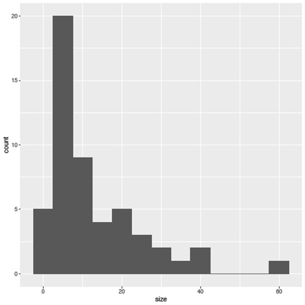
As mentioned in the introduction one of the fundamentals of ggplot2 is that it is based on the ‘Grammar of Graphics’ and requires three things to create a plot: (1) a dataset, (2) information on how we want the plot to look (aesthetics), and (3) the type of graph we want to use (called a geom). So we will begin with a simple plot consisting of one continuous variable. Let’s say we are interested in seeing the distribution of body size across our 52 species: we could use a histogram. The first thing we need to do is create a new data object that contains the data that we are going to plot. For this we use the ggplot function as below. This is the main function in the ggplot2 package and provides much more control than qplot:
sizePlot <- ggplot(species, aes(size))As well as assigning the dataset we are using, species, there is an additional argument here, aes. At the moment we’ve only used it to assign which variables we want to include in the plot, but as you will see it has an important part to play in specifying other aesthetics associated with the plot (we’ll skip this step for a moment). The next step is to choose which geom (type of plot) we want to use. All geoms built into the package start with a geom_ prefix and cover a wide range of plots for different kinds of continuous and categorical data; Table 1 (over the page) includes a list of common plot types and the relevant geom and data types they handle. Here we want to create a histogram, so we use the geom_histogram function. As I mentioned these functions work in layers so we can simply add the new function to our exisiting dataset, sizePlot, using an addition (‘+’) symbol, as in:
sizePlot + geom_histogram(binwidth=5)| Syntax | Plot type | Data required | Data required |
|---|---|---|---|
| geom_hist() | Histogram plots | One continuous | One continuous variable |
| geom_density() | Density plots | One continuous | |
| geom_bar() | Bar plots | One discrete variable | |
| geom_point() | Scatter plots | Two continuous variables | Two continuous variables |
| geom_line() | Line Plots | Two continuous variables | |
| geom_smooth() | Fitted line to plots | Two continuous variables | |
| geom_text() | Text to plots | Two continuous variables | |
| geom_bar() | Bar plots | One continuous, one categorical | One continuous and one discrete variable |
| geom_violin() | Violin plots | One continuous, one categorical | |
| geom_boxplot() | Box plots | One continuous, one categorical |
Figure 6.2 shows what this will output. As you see we can set the width of the bins; if you leave it blank it will automatically be set to 30, which may not be appropriate for your data.
It is worth noting that you don’t need to assign the data to their own variable, and the same plot can be achieved using the following code, although it is important to note that the ‘+’ symbol must be placed at the end of the first line otherwise R will run this line, and produce a blank graph, rather than wait for the next set of instructions.
ggplot(species, aes(size)) +
 geom_histogram(binwidth=5)
As I mentioned there are a range of available geoms that you can use for this kind of continuous data, such as:
sizePlot + geom_area(stat='bin') # for area plotssizePlot + geom_density() # for density plots
Plotting two continuous variables
Now we have the basics let’s examine this species dataset in more detail, starting with replicating the plot in Figure 6.1 using ggplot. The first step is to create the dataset we wish to use:
sizeagePlot <- ggplot(species, aes(x=age, y=size))Next we need to decide on the kind of plot we want, which in this case of Figure 6.1 is a typical scatter plot, for which the appropriate geom is called geom_point:
sizeagePlot + geom_point()What can we tell from this initial plot? Overall within this group of species there is a trend towards smaller size over time (note the axes have the present day to the left with older species to the right, we will fix this in a moment). Using str(species) to look at the structure of this dataset we can see that there are four genera (genusa to genusd), two families (familya and familyb) and two locations (north and south) present in this dataset. From this initial observation we may next want to know if this is a consistent trend across all these genera and families or indeed if there is a difference between these two locations. Going back to the step we skipped earlier, the aesthetics, we can tell geom_point which variable to use to colour the individual points. In this case let’s start by looking at the genera by using the aes argument to assign the genus variable to colour (‘color’ is also accepted):
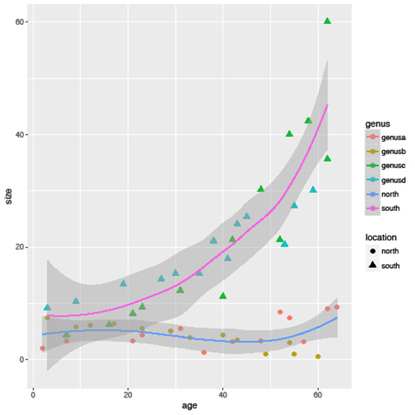
sizeagePlot + geom_point(aes(colour=genus))With this, ggplot has assigned each genus its own colour (there are ways to change the default range of colours) and has added a legend to the right of the plot with an explanation of the colours used. Not only does this save a lot of effort in getting the legend right but it importantly reduces the chance of making a mistake by assigning a category to the wrong colour. However, we are not done yet – we can assign multiple variables at once, so let’s now assign a different shape to species from different locations using the shape argument:
sizeagePlot + geom_point(aes(colour=genus, shape=location))Now, as well as the distinction between families, the legend helpfully shows that the species from the north location are represented by circles and the south by triangles. Further aesthetic qualities we can modify include the transparency of the points using alpha:
sizeagePlot + geom_point(aes(colour=genus, alpha=location))and the size of the points using size:
sizeagePlot + geom_point(aes(colour=genus, size=location))If, rather than select the size, colour or shape of points according to a variable, you want to change all points at once to the same size or colour, place the relevant argument outside of aes as in:
sizeagePlot + geom_point(aes(colour=genus), size=2)As with the first example there are a range of geoms that you can use for your plot; while I don’t have space to go through them all, one I want to highlight is geom_smooth, which adds a fitted line to your plot. Rather than replacing the scatterplot we can add this to our existing plot by using the ‘+’ operator at the end of the last statement:
sizeagePlot +
 geom_point(aes(colour=genus, shape=location)) +
  geom_smooth()
One final point to illustrate the capabilities of this package: try replacing the geom_smooth() statement with geom_smooth(aes(colour=location)); this automatically adds a separate fitted line for each location (Figure 6.3).
Plotting categorical variables
By using a scatterplot in the above examples we get a good idea of the overall trends in size across all species as well as for genera and different geographical locations, but it doesn’t make it easy to visually compare sizes between genera, families or locations. For that there are more appropriate methods such as boxplots and violin charts. To do this we need to create a different dataset that specifies the categorical variable we want to compare.
sizegenusPlot <- ggplot(species, aes(genus, size))There are a couple of differences in this example: firstly we don’t specify which variable is on the x and y-coordinates, however it is important that the categorical variable, here the genus, is placed before the continuous variable, here the size variable. In order to plot a boxplot we use the geom_boxplot function:
sizegenusPlot +
 geom_boxplot()
From this boxplot it shows clearly that genera a and b have a smaller body size distribution than both genera c and d. In addition, as in the previous examples, we can colour this boxplot by another variable, say by location, using the aes argument (Figure 6.4), and the fill argument uses the selected variable to colour the individual boxes (the colour option is used to select the border colour of each box):
sizegenusPlot +
 geom_boxplot(aes(fill=location))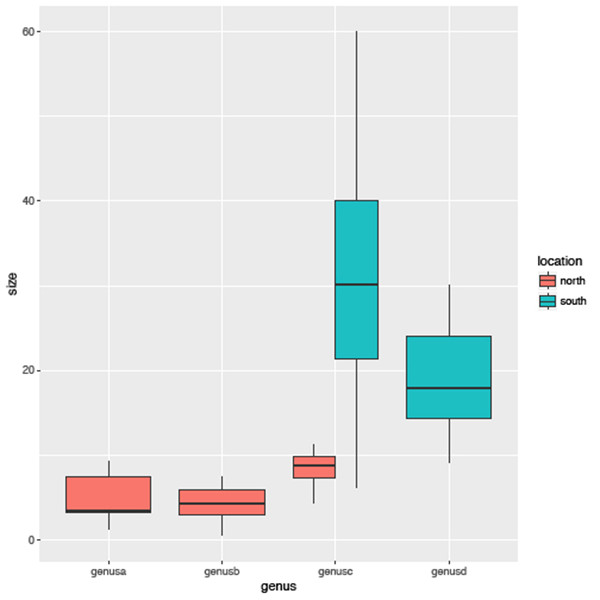
You will see that this is largely identical to the previous plot with one important difference, that genus c has been divided into two separate plots. This is because there are species from this genus in both the north and south location so in essence this method allows us to look at the distribution of subsets of the data with ease.
Facets
The last area I want to cover here is faceting. Facets allow for multiple plots to be created easily based on subsets of the data. Rather than plotting all species in the one plot as in Figure 6.1, you may want to create a separate plot for each genus, especially if your dataset is large. To do this we add the facet_grid function and specify the variable we want to use to subset the data, in this case genus. Using the syntax below it will organize the plots into rows (Figure 6.5):
sizeagePlot +
 geom_point(aes(colour=genus, shape=location)) +
  facet_grid(genus ~ .)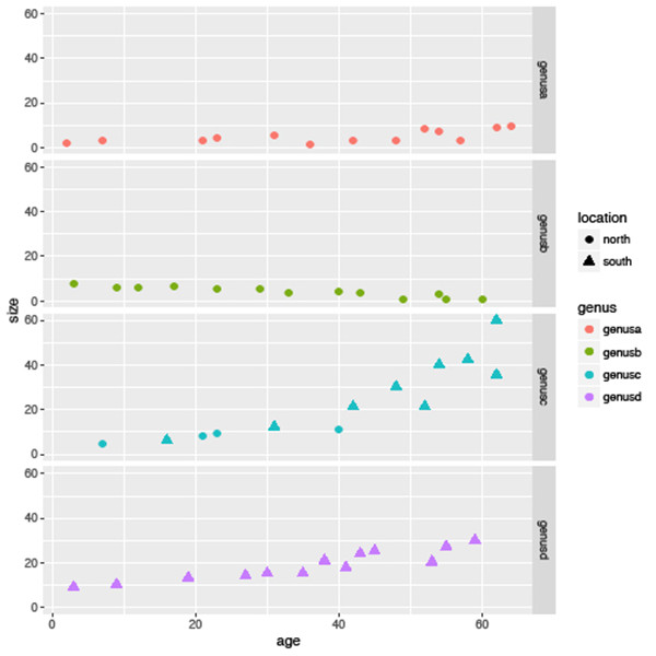
To arrange as columns, place the variable of interest after the ‘~’:
  facet_grid( ~ genus)
  # NOTE the lack of a period (.) when organizing as columns
As an exploratory technique, facets are really useful when you have large numbers of categories in the variable you are interested in. However, in this instance it may be better to arrange the plots in a grid rather than in rows or columns; for this we can use facet_wrap and specify the layout by using the ncol and nrow argument, as in:
facet_wrap(~genus, nrow=2, ncol=2)Lastly, facets can be used to subset by multiple variables at once using the ‘~’ operator to separate both variables. Say we wanted to compare body size trends by both location and family at once; we could use the following (Figure 6.6):
sizeagePlot +
 geom_point(aes(colour=genus, shape=location)) +
  facet_grid(family ~ location)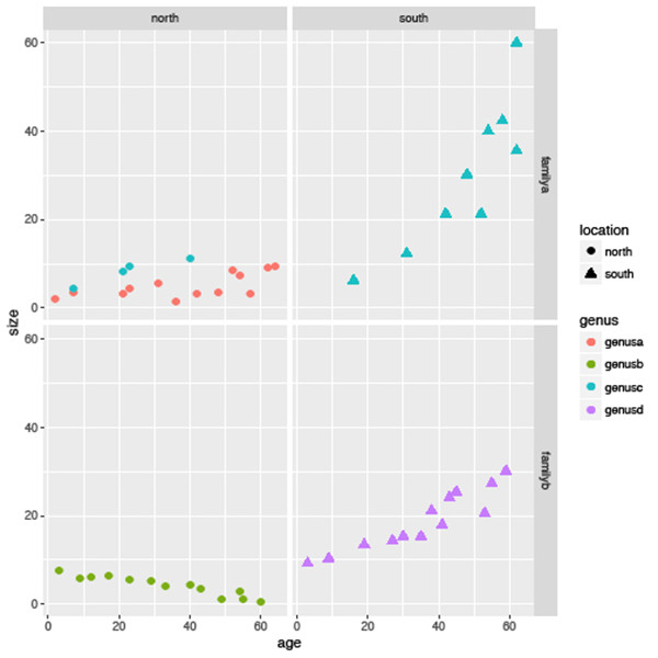
In summary, you will see that while there is an overall decreasing trend in the data as shown in Figure 6.1 this is not consistent across all genera, families or locations.
Additional controls
As I mentioned at the outset I wanted to cover the basics of this package rather than provide a walk-through of all its capabilities, however I want quickly to highlight some other controls that are available – ‘themes’, ‘legends and labels’ and ‘scales’ (for a comprehensive and handy guide see Hadley Wickham’s cheat sheet for ggplot2 at goo.gl/mPPrsy).
Themes
Firstly, if you don’t like the look of the standard plot you can change it to one of several themes that are built into the package; for example, for a more simplistic look without the grey background:
sizeagePlot + geom_point(aes(colour=location)) +
 theme_minimal()
In an extreme case you can strip right down to just the basics using theme_void:
sizeagePlot + geom_point(aes(colour=location)) +
 theme_void()
For a wider range of themes follow the examples at the start of this article to install and load the ggthemes package. This package provides a range of extra themes that allow you to create the appearance of base graphics in R using theme_base, for example to recreate the look of graphics from The Economist using theme_economist, those of political analytical website FiveThirtyEight.com using theme_fivethirtyeight, or finally, you can step backwards and use theme_excel to make your fantastic data look like they’ve come out of excel!
Legends and labels
Secondly, you are not restricted as to the location of the legend: using legend you can place it on the top, bottom or left of the plot:
sizeagePlot + geom_point(aes(colour=location)) +
 theme(legend.position="bottom")
You can also give the plot a title and change the axis labels using ggtitle, xlab and ylab separately, or labs to save time:
sizeagePlot + geom_point(aes(colour=location)) +
 labs(title="Body size over time", x="Size (mm)", y="Age (Ma)")
Scales
Finally, as I noted earlier the scale of the x-axis means that the oldest species are plotted to the right and the youngest on the left. The last aesthetic control I cover here is how to change the axes of the plot, using scale_x_reverse (scale_y_reverse is the equivalent for the y-axis):
sizeagePlot + geom_point() +
 scale_x_reverse()
We can also transform the nature of the axes; say we wish to show the body size of these species on a logarithmic scale, we can use scale_y_log10:
sizeagePlot + geom_point() +
scale_y_log10()
Summary
I hope you now have an appreciation of the capabilities of the tidyverse and the ggplot2 package in particular. As I said right at the beginning of this series, its graphics capability is one of R’s core strengths, and although one can spend hours making amazing graphics, especially if you want to have multiple charts in the one window, ggplot2 is much more intuitive and easier to use. One thing I haven’t been over in much detail is the nature of the datasets that the tidyverse employs. If you open the mpg data you will see that neither does it display every row of the data (it has 38 and R will display only the first ten) or even all of the variables (depending on how you have the R console set up). This, so-called “tidy” data (hence the tidyverse), is designed to give you the most information about your data without flooding the screen with all the variables. Trust me, this is useful when you have dozens of variables and hundreds or more observations. How to create and modify tidy data will be the focus of the next article.
Futher Reading
Crawley, M. J. 2005. Statistics: an introduction using R. John Wiley and Sons, New Jersey. 342 pp.
Field, A., Miles, J. and Field, Z. 2012. Discovering statistics using R. SAGE publications Ltd, New York. 992 pp.
Wickham, H. 2009. ggplot2: Elegant Graphics for Data Analysis (Use R!). Springer. 224 pp.
Wickham, H. 2014. Advanced R. Chapman & Hall/CRC, 478 pp
