7. The tidyverse II - data wrangling with dplyr and tidyr
Last time I focused on using the ggplot2 package to make charting your data quicker and easier and by extension provided an introduction to the tidyverse. However, at that time I didn’t go any further into the wider tidyverse, specifically the dplyr and tidyr packages that are used for data processing and are the real work horses of the tidyverse. The aim of this article is to cover the main functions of these packages, to demonstrate how they can make your code more efficient and, importantly, easier to understand and duplicate for others.
What makes a tidy dataset?
One of the essential elements of the tidyverse is the development of a standardized format for data; these are known as tidy datasets. I am not going to spend a great deal of time delving into the philosophy of tidy datasets (that has been done better elsewhere, for more detail see Wickham (2014)). Put simply, there are three rules that define whether a dataset is tidy or not:
- Each variable must have its own column.
- Each observation must have its own row.
- Each value must have its own cell.
Taking an example from Wickham (2014) to illustrate the difference between tidy and untidy datasets (any dataset not in a tidy format is by definition untidy).
| Name | treatment (a) | treatment (b) | |
|---|---|---|---|
| 1 | John Smith | NA | 18 |
| 2 | Jane Doe | 4 | 1 |
| 3 | Mary Johnson | 6 | 7 |
This is an example of an untidy dataset and is only one way in which these data could be arranged (in itself a marker of an untidy dataset). Using the above definition of a tidy dataset we can see that this violates the first two rules, as each row contains more than one observation; i.e. each row has a value for both treatments, and also the variable for what treatment is being used is split over two columns in this example. Below are the same data but in a tidy format. I hope you can appreciate that this better adheres to these rules, in that each row only contains one observation, i.e. a row for every combination of person and treatment:
| Name | Treatment | n | |
|---|---|---|---|
| 1 | John Smith | a | NA |
| 2 | John Smith | b | 18 |
| 3 | Jane Doe | a | 4 |
| 4 | Jane Doe | b | 1 |
| 5 | Mary Johnson | a | 6 |
| 6 | Mary Johnson | b | 7 |
There are several advantages to having all your data in a consistent format: (1) it makes all the techniques we will go through below easier to learn because they will operate the same on any tidy dataset; (2) R is particularly effective at working with data in a vector format and tidy datasets make this a lot more intuitive (and allows others to use your code on their tidy data easier); and (3) if your datasets are already in this format it reduces the amount of time you will spend cleaning your data – which can be the most time-consuming part of any analysis.
An introduction to piping
Another aspect of the tidyverse I didn’t discuss last time but we did see it in operation are pipes. These are extremely useful in making your code easier to follow and the process of debugging much simpler; this is especially important for the replication of your work by others. A pipe works by passing the output from one function directly into the next. This is useful if you are prone to either creating many intermediate versions of your data for each data processing step, or if you tend to nest functions within each other; i.e.:
results <-functionThree(functionTwo(functionOne(data), arguments),morearguments)By using a pipe you no longer need to employ either of these methods. The pipe function is built into the magrittr package which will be loaded with the rest of the tidyverse, and is defined as %>% (shortcut key: Cmd+Shift+M for Mac, Ctrl+Shift+M for Windows). In simple terms the way this works is that the output from one function is ‘piped’ directly into the next function. We’ll go over this in more detail below but for now here is a simple example:
x <- rnorm(10)
x %>% max()
Here we take the values of x (calculated in a normal fashion) and ‘pipe’ them into the max function, which then prints the maximum value of all values in x to the R console. We can still assign the results of this pipe to a new variable if we need to through the usual method:
y <- x %>% max()At the moment this may not seem like a big deal, and if anything may involve more typing (!), but by the end of the article I hope you will be able to appreciate the benefit of this method when writing code that involves lots of data processing.
Cleaning and tidying a dataset
For the bulk of this article I will walk through a series of data processing steps, using a pipe, to create a clean and tidy dataset that is ready to be used to create plots in ggplot or for further analyses. For this tutorial I have created a dataset that does not fit the rules for a tidy dataset. It contains 31 rows of information, each of which contains measurements for a species across 31 different localities. The entire pipe we are going to use looks like this:
tidy <- untidy %>% tbl_df() %>%
   select(-Unknown) %>%
    mutate(species=str_to_lower(species)) %>%
     gather(key=Location, value=Size, starts_with("Loc")) %>%
      filter(!is.na(Size)) %>%
       rename(layer = Location) %>%
        left_join(locations, by="layer")
A couple of quick notes before we start: (1) ggplot2 works in a similar way but uses an addition symbol (+) instead of a %>% ; (2) the %>% symbol must be at the end of each line and not the beginning for the pipe to work; (3) to run the code up to any individual line just omit the %>% from the end of the line you want to stop at.
Before we work through this pipe line-by-line it is worth having a close look to see if you can get a sense of what each process is carrying out; this is because one of the principles of the tidyverse, as mentioned above, is to make coding more intuitive to follow.
The first step, as always, is to set up the workspace for our purposes by loading in the relevant libraries and data we need. As mentioned last time, we can use the following code to install (if you haven’t already) and load all the associated tidyverse libraries in one step:
install.packages(“tidyverse”, dependencies=TRUE)
library(tidyverse)
Next we need to load in the datasets we require, including our untidy dataset and a second dataset containing location information that we will use later:
untidy <- read.csv(“untidy.csv”, header=TRUE)
locations <- read.csv(“locations.csv”, header=TRUE)
Now, we have everything we need and can start to create a tidy version of these data. To start with, as we did when exploring ggplot2, we should convert the untidy dataset to a tibble using tbl_df. This makes the data easier to explore as rather than printing all the data only a selection is shown:
tidy <- untidy %>% tbl_df() %>%There are several ways to select the relevant variables depending on your data, such as selecting all columns between species and LocB_30 using:
select(species : LocB_30) %>%or using helper functions to provide select with a list of columns to remove. In the example below we can specify the species variable as well as those that start with ‘Loc’:select(species, starts_with("Loc")) %>%
When looking at the data you may have noticed that the first two rows have the same species but in the second row the name has been capitalized. This issue may cause problems later on so it is best we fix it early. A simple fix for this is to convert all the species names to lower case using the str_to_lower function from the stringr package (the tolower function in base R can also be used) as follows:
mutate(species=str_to_lower(species)) %>%Making the data tidy
At the outset we discussed the definition of a tidy dataset, and if you have a look at this dataset once again you will see that it still doesn’t fit this definition. Firstly, not every variable has its own column: locality is a variable in its own right and should be in a distinct column. Also each row contains multiple observations, i.e.one for each species per locality. So, how do we make this dataset comply with the rules? This may sound like a complicated affair, involving many steps, but handily the gatherfunction does everything we need in one step:
gather(key=Location, value=Size, starts_with(“Loc”)) %>%This function will ‘gather’ all the values contained in the columns that start with ‘Loc’ and will create two new variables: the key (which we have called Location) contains the location names (i.e. LocA_01 etc. that were column names in the original dataset), and the value (called Size) contains the size information in observations spread across multiple columns. If you now open this dataset, either by printing it to the console or by using View(tidy), you will see that it is a lot easier to navigate with only three variables and a row for each observation; thus it now complies with the rules defining a tidy dataset.
Before we move on to undertaking some analyses there is some additional cleaning we can do. As highlighted earlier the dataset contains missing observations; these can be easily removed using the filter function, which works in a similar way to select but operates on observations (rows) rather than variables (columns). Here we can use a logical statement to retain all observations that are not NA:
filter(!is.na(Size)) %>%As will become clear in a moment we will also want to rename the Location variable to layer. This can be done using the rename function:
rename(layer = Location) %>%Merging datasets
It is very common that as analysts we may want to combine various datasets prior to conducting any analyses. Within dplyr there are several functions that can be used to combine datasets (with similar functions in base R). Each of these is designed to join datasets in different ways (Figure 1). The last step in the pipeline we have been working through is to merge our new tidy dataset with the other file we loaded in at the start. If you now look at the locations dataset you will see it contains information about each locality, including a broader location category and an age value.
Here we will use the left_join function which will match the rows in b with those in a. As such the resulting dataset won’t include any rows from b where a match wasn’t found in a.
left_join(a, b, by=”variable”) %>%In our analyses, as we are using a pipe, we only need to input the name of the dataset to be merged (i.e. not the one that will be automatically input from the previous steps in the pipe), and the name of the variable we want the datasets to be matched using. In this instance we want to use the name of the localities, which is the common variable between both datasets (hence the use of the rename function to ensure the matching variables in both datasets had the same name):
left_join(locations, by=”layer”) %>%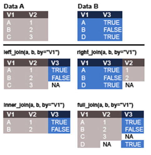
With that, all the steps in the pipe are completed. If we run all of these together and view the resulting tidy dataset using View(tidy) the result is a dataset that contains four variables: the name of the species, its location, the size of the species, and the age of that location.
Plotting data
With all this work to tidy our dataset it is now fully compatible with the analytical tools available in the tidyverse. But before we do any analyses it is worth returning to the topic of the last article and plotting some of these data. Creating a plot using ggplot will now be much easier than it would have been with the data in their original untidy state.
Below are two examples of code that will take in our tidy data to create a scatterplot and a histogram. If you are uncertain of what this code is doing, I recommend going back to the previous article that explains these methods in more detail. The first example is a scatterplot of all sizes against age of locality, coloured by the values in the location variable. In addition, a smoothing line for all data is fitted (Figure 2).
sizeagePlot <- ggplot(tidy, aes(x=age, y=Size))
 sizeagePlot +
  geom_point(aes(colour=location)) +
   geom_smooth()
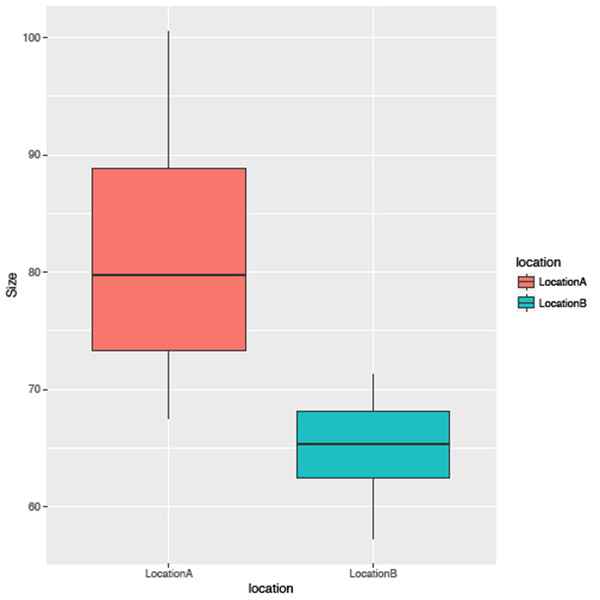
The second example uses the same data but is represented as a histogram for the sizes of all species occurrences, again grouped by location (Figure 3).
sizelocationPlot <- ggplot(tidy, aes(location, Size))
 sizelocationPlot +
  geom_boxplot(aes(fill=location))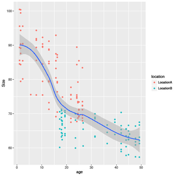
Grouping, summarizing and mutating data
As mentioned above we can now easily employ other analytical techniques contained in the tidyverse. One of the handy functions in the tidyverse is summarise. This is used to calculate descriptive statistics using your data. A simple example, in which we can also use a pipe, would be to calculate the mean size of all species in our data:
tidy %>% summarise(avg=mean(Size))This will return the mean value of the Size column under the new variable avg:
# A tibble: 1 × 1
         avg
        <dbl>
1      73.59091
However, while we could also do this using the mean function, the tidyverse allows us to go one step further and include the group_by function so we can calculate these statistics for groups within the data. For example, if we wanted to calculate a range of statistics (e.g. the minimum, mean, maximum values and standard deviation for each species), and also the first and last appearance of each species, we could use the following code:
species_summary <- tidy %>% group_by(species) %>%
  summarise(Min=min(Size), Avg=round(mean(Size),2), Max=max(Size), N=n(),
   round(SD=sd(Size),2), FA=max(age), LA=min(age))
This will create a new dataset with a row for each species, and a column for each new calculated variable. The first three rows of this dataset look like this:
# A tibble: 26 × 8 species Min Avg Max N SD FA LA <chr> <dbl> <dbl> <dbl> <int> <dbl> <dbl> <dbl>1 ashcroft 69.2 84.35 100.5 15 10.36 26.4 1.1 2 bowie 67.7 75.55 89.3 10 8.86 24.9 1.1 3 clapton 83.4 87.98 90.4 9 2.36 26.4 1.5
We are not limited to grouping by one variable; if we wanted to group by both species and location we can use:
group_by(species, location)The last function I want to cover, called mutate, allows us to calculate new variables based on the existing data which are then appended to the end of those data. In the previous example we calculated the first and last appearance of each species using the min and max functions. Now using mutate we can also calculate the range of each species. By adding the line of code below to the previous example a new variable, called Range, will be added to species_summary that contains the difference between the Max and Min variables we created earlier:
%>% mutate(Range=Max - Min) # A tibble: 26 × 9 species Min Avg Max N SD FA LA Range <chr> <dbl> <dbl> <dbl> <int> <dbl> <dbl> <dbl> <dbl>1 ashcroft 69.2 84.35 100.5 15 10.36 26.4 1.1 31.3
There is one final example, combining all the elements of this article with those of the previous one. In an earlier example we used ggplot to plot elements of the tidy dataset, however, we didn’t include this code in the original data processing pipe. If we wanted to, we could combine all the steps above to summarise and mutate the tidy data then pipe the results into ggplot directly. By adding the code below to the previous pipe we plot the average size of each species against its first appearance date (Figure 4) (remember that the syntax for a pipe in ggplot2 is represented by a + symbol):
ggplot(aes(x=FA, y=Avg)) + geom_point()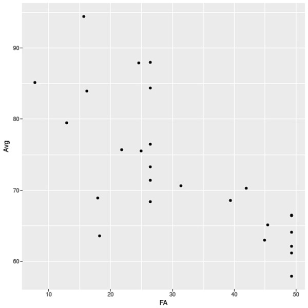
Summary
The aim of this article, as well as the preceding example, was to demonstrate just how much the tidyverse has influenced coding in R in recent years and how, by learning to use it effectively, it can help make your coding life easier and your code simpler for others to follow. Also I hope you can appreciate how pipes have these above benefits as well as lowering the risk of creating errors that can be introduced easily through the use of intermediate datasets, and making the flow of data through your code easier to understand.
There was only so much I could cover in a short article and this only scratches the surface of the tidyverse. Hadley Wickham and colleagues have written a number of books on the subject that are an excellent resource for learning more about the techniques covered here. Also a number of useful ‘cheat sheets’ are provided on the RStudio website (https://www.rstudio.com/resources/cheatsheets/) which cover everything I have discussed here and more besides.
References
Wickham, H. 2014. Tidy Data. Journal of Statistical Software, 59 (10). http://vita.had.co.nz/papers/tidy-data.html.
Futher Reading
Crawley, M. J. 2005. Statistics: an introduction using R. John Wiley and Sons, New Jersey. 342 pp.
Field, A., Miles, J. and Field, Z. 2012. Discovering statistics using R. SAGE publications Ltd, New York. 992 pp.
Grolemund, G. and Wickham, H. R for Data Science. O’Reilly Media, 250 pp. http://r4ds.had.co.nz/tidy-data.html.
Wickham, H. 2014. Advanced R. Chapman & Hall/CRC, 478 pp. http://adv-r.had.co.nz/.
Data Wrangling with dplyr and tidyr Cheat Sheet: https://www.rstudio.com/wp-content/uploads/2015/02/data-wrangling-cheatsheet.pdf.
Data Visualisation with ggplot2 Cheat Sheet: https://www.rstudio.com/wp-content/uploads/2015/03/ggplot2-cheatsheet.pdf
